Category: Comics

Z-View: Shaft #2 by Walker and Evely

Shaft is an on-going series published by Dynamite. Shaft created by Ernest Tidyman.

Writer: David F. Walker

Artist: Bilquis Evely

Colorist: Daniel Miwa

Cover Shown: Denys Cowan, Bill Sienkiewicz & Ivan Nunes

Every great detective has their first case. For John Shaft, that first case seems simple enough. But tracking down a missing person for his girlfriend quickly turns into a matter of life and death. With the bodies piling up, Shaft realizes he’s in over his head. But can he stay alive long enough to figure out what is going on, or will his first case be the death of John Shaft?

*** Beware – spoilers may be found below ***

The Good:

  • Still diggin’ the art by Bilquis Evely.
  • “Could spot a booster from a mile away.  That’s ’cause I used to be a booster.”
  • Double page splash showing Shaft’s relationship deepening.
  • “Keeping her safe is the most important thing.  That’s the only thing keeping the four-eyed ************ alive.”
  • “It was like someone opened a cage and let the animal out.”
  • Evely gets the feel of the period down pat.

The Bad:

  • “The fact that they’re following us this close says a lot.  First, they don’t care if we know.  Second, if they don’t care that we know, they don’t think we’re a problem.”
  • “They were either cops or gangsters…”

The Ugly:

  • The last page of the issue… and I can’t wait for #3!


Shaft #2 should appeal to fans of the Shaft movies and is for mature audiences due to adult language.

Rating: 5 out of 5

Rating:

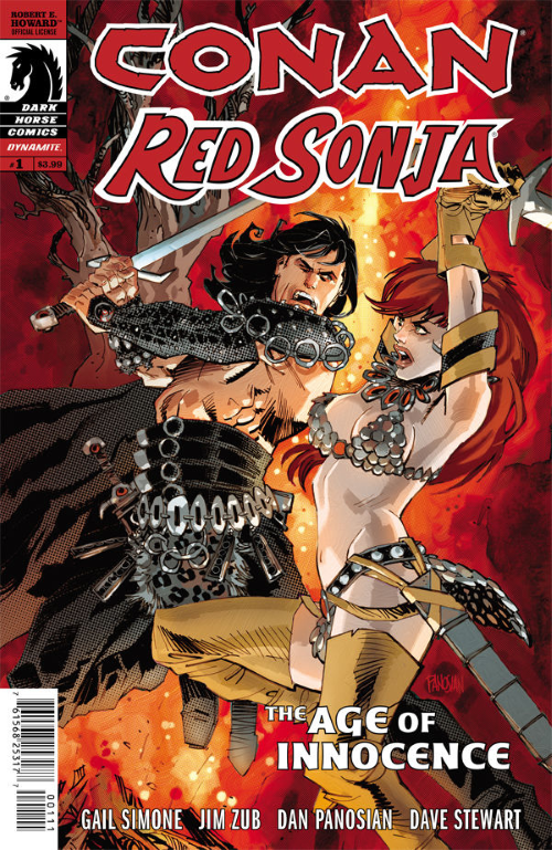
Z-View: Conan Red Sonja #1 by Simone/Zub and Panosian

Conan Red Sonja is a mini-series published by Dark Horse.

Writer:  Gail Simone, Jim Zub
Artist:  Dan Panosian
Colorist:  Dave Stewart
Cover Artist:  Dan Panosian

In a story spanning multiple eras in the lives of these classic characters, Conan and Red Sonja become comrades to take down a sorcerer-priest hell bent on creating a dark new age in Hyborian warfare!

*** Beware – spoilers may be found below ***

The Good

  • Great cover by Dan Panosian!
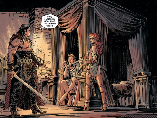
  • The first scene with Conan!
  • Panosian’s scenes have a great feel of depth to them – see page 11, panel 3.
  • “Well, THAT seems excessive.”
  • “Yes, it is my burden in life.  Over- Confidence.”
  • “You fight good. For a Cimerian I mean.”
  • Preview of the next cover by Panosian!

The Bad:

  • If Sonja finds you are “murdering beasts for money.”
  • Some fans find this young Conan too pretty, too fancy.  I look at it as just another take on a classic character.

The Ugly:

  • If Conan has to silence you.
  • The last page of this issue’s story.


Conan Red Sonja #1

Rating: 4 out of 5

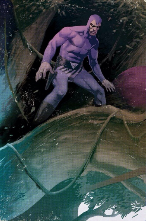
Ron Salas has that Phantom Vibe!

That’s Ron Salas’ variant cover art for The Phantom #1.

Bleeding Cool posted a slightly larger version of it along with a black and white version with this comment:

Now this issue has the Darwyn Cooke cover as do the others and it has a Rob LIefeld cover, but this one also has a very cool looking Ron Salas cover which we have here both colored and uncolored. Honestly, of the three I think this is the one I’d grab because it has such a cool Phantom vibe.

Wow!  High praise indeed!

Z-View: Men of Wrath #4 by Aaron and Garney

Men of Wrath is a five issue mini-series created by Jason Aaron & Ron Garney published by Marvel.

Writer: Jason Aaron

Artist: Ron Garney

Colorist: Matt Milla

Letterer: Jared K. Fletcher

The last living men of Rath face off, as Ruben comes gunning for Ira to protect the life of his unborn child. With father and son standing poised to kill each other, will the Rath curse come full circle?

*** Beware – spoilers may be found below ***

The Good

  • Nice cover!
  • Ira’s grocery store run-in with the Sheriff.
  • The last page is a shocker.

The Bad:

  • Ruben proving to himself he’s a “man.”
  • Going from wanting to kill your soon to making him wealthy.
  • “She’s out in the backyard. Buried under a sycamore.”

The Ugly:

  • The way Ira talks to his son.
  • The way Ruben let’s his gun answer back.


Men of Wrath #4  is for mature readers due to mature language and violence.

Rating:

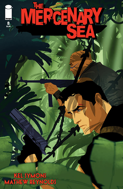
The Mercenary Sea #8 by Symons and Reynolds

The Mercenary Sea is an on-going series created by Kel Symons & Matthew Reynolds published by Image.

Writer: Kel Symons

Art and Colors: Matthew Reynolds

Letterer: Pat Brosseau

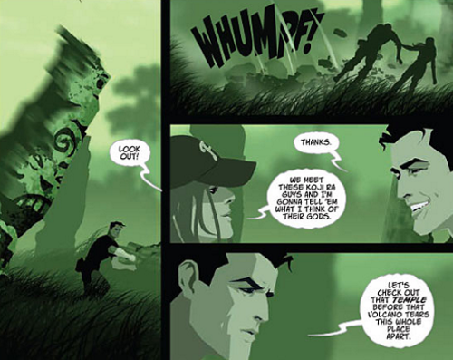
“ON TREASURE ISLAND” The second of a two-part story: On the hunt for Koji Ra, Jack and the crew of the Venture explore ancient ruins on a deserted island and run into an old adversary. This issue also includes a bonus short story just in time for Christmas.

*** Beware – spoilers may be found below *** The Good

  • Matthew Reynolds kicks things off with another impressive cover.
  • Kel Symons sets the table with a race against time [an unstable volcano about to blow] and an old adversary hunting for the same treasure.
  • Regular readers will be surprised by this one: I like the blur effect on page 6, panel 3.
  • The splash on page 11.
  • “Can we go again?”
  • The bonus Christmas story!

The Bad:

  • “The room is flooding!”
  • “There’s too much water pressure.”
  • “No good, Skipper.  No way out up here.”

The Ugly:

  • The centipede’s path.

The Mercenary Sea #8 should appeal to all who old time action and adventure.

Rating: 4 out of 5

The Mercenary Sea #7 by Symons and Reynolds


The Mercenary Sea is an on-going series created by Kel Symons & Matthew Reynolds published by Image.

Writer: Kel Symons

Art and Colors: Matthew Reynolds

Letterer: Pat Brosseau

“JOHNNY ONE-NOTE” The book BuzzFeed calls one of the top indie comics you should read returns with an all-new adventure. Jack Harper, captain of the Venture, tracks down clues about the legend of Koji Ra from an antiquities dealer in occupied China.

*** Beware – spoilers may be found below ***

The Good

  • Bottom panel page 7 – simple but effective
  • Abbott and Costello would have been proud – page 9, panel 1
  • “I owe that guy a drink.”
  • Last page splash.

The Bad:

  • Usually I lead off The Good with praise for another Matthew Reynolds‘ cover.  This one isn’t bad, but it isn’t up there with my other Mercenary Sea favorite covers.  Any guesses why?  Yep, the background blur effect.

The Ugly:

  • Not a thing this issue.

The Mercenary Sea #7  should appeal to all who old time action and adventure.

Rating:

Z-View: The Mercenary Sea #6 by Symons and Reynolds


The Mercenary Sea is an on-going series created by Kel Symons & Matthew Reynolds published by Image.

Writer: Kel Symons

Art and Colors: Matthew Reynolds

Letterer: Pat Brosseau

“TOP HAT, WHITE LIE, AND TALES” Jack and Evelyn, a.k.a. “Top Hat,” are captured by Tono, locking the outclassed Venture into combat with a top-of-theline Japanese destroyer.

*** Beware – spoilers may be found below ***

The Good

  • Another excellent cover by Matthew Reynolds
  • Symons comes up with a great and ingenious way for Jack to get word to his crew.
  • Page 14  is really nicely done.

The Bad:

  • “We took a direct hit aft, sir!”
  • “Feels like I just cut in on another girl’s dance.”  “I don’t take spins around the floor with my crew.”

The Ugly:

  • Still not a fan of the out of focus/blur effect — see page 19.

The Mercenary Sea #6  should appeal to all who old time action and adventure.

Rating:

Z-View: The Mercenary Sea #5 by Symons and Reynolds


The Mercenary Sea is an on-going series created by Kel Symons & Matthew Reynolds published by Image.

Writer: Kel Symons

Art and Colors: Matthew Reynolds

Letterer: Pat Brosseau

MARCH OF THE GRENADIERS The crew of the Venture teams with a band of Chinese guerillas to rescue “comfort women” held captive by Japanese soldiers.

*** Beware – spoilers may be found below ***

The Good

  • Excellent cover – one of Reynold’s best yet.
  • Page 8 splash!
  • The night scenes of battle — low contrast color throughout that make bright things pop [blood, explosions…]
  • Great cliffhanger leading into issue 6.

The Bad:

  • Being a Chinese pilot trying to get airborne.
  • Winning a battle, being hailed a “savior” by villagers, heading back to the sub and meeting…

The Ugly:

  • Still not a fan of the out of focus/blur effect on page 15.

The Mercenary Sea # 5  should appeal to all who old time action and adventure.

Rating: 4 out of 5

Z-View: Sherwood Texas #5 by Berryhill and Hillyard

Sherwood Texas is a five issue mini-series published by 12-Gauge Comics.

Sherwood Texas #5

Writer: Shane Berryhill

Artist: Daniel Hillyard

Colorist: Charlie Kirchoff

Letterer: Ed Dukeshire


John Prince and Rob Hood slug it out for the soul of Sherwood, Texas in the stunning conclusion to this tale of betrayal and revenge. You don’t want to miss the big finale of this smash-hit series! 

*** Beware – spoilers may be found below ***

The Good

  • Andrew Robinson’s cover!
  • Prince’s anger gets the best of him and his emotional swing is more realistic than one would expect.
  • Page 13, Panel 2.
  • The story has a satisfying wrap-up so that no sequel is needed but the groundwork is laid just in case.

The Bad:

  • It doesn’t matter if you’re family if the Prince thinks you ripped him off.
  • Being discovered as a “snitch” by the Prince.
  • The Nobles luck because Loxley’s aim is so good.
  • The framing of the covers was a cool idea, but I’d rather see more of Andrew Robinson’s art!

The Ugly:

  • “Come on, Loxley, make it easy on –”  “Charlie!”


Sherwood Texas #5

Rating:
I enjoyed the Sherwood, Texas mini-series enough that I’d pre-order a sequel or at least check out anything else that Berryhill and Hillyard do.

Z-View: Sherwood Texas #4 by Berryhill and Hillyard

Sherwood Texas is a five issue mini-series published by 12-Gauge Comics.

Sherwood Texas #4

Writer: Shane Berryhill

Artist: Daniel Hillyard

Colorist: Charlie Kirchoff

Letterer: Ed Dukeshire


The battle moves south of the border as Hood goes into Mexico looking to thwart the Nobles at every turn. Back in Sherwood, John Prince is about to make a discovery that changes everything.

*** Beware – spoilers may be found below ***

The Good

  • Berryhill comes up with a nice explanation of how Will is kept safe while recovering.
  • Ann Willis is a great supporting character.  “Remind me never to get on your bad side” – indeed.
  • The Jesters taking the fight across the border.

The Bad:

  • The casual way that Sheriff Hoyt shows he has tired of the interrogation.  [So bad it could have been listed in “the good” section.]

The Ugly:

  • Prince’s nephew’s situation… love the last panel of the book!


Sherwood Texas #4

Rating:
Sherwood Texas #3 by Berryhill and Hillyard

Sherwood Texas is a five issue mini-series published by 12-Gauge Comics.

Sherwood Texas #3

Writer: Shane Berryhill

Artist: Daniel Hillyard

Colorist: Charlie Kirchoff

Letterer: Ed Dukeshire


It’s time to go on the offensive! Rob Hood and the Jesters hatch a plan to rob John Prince and free the kidnapped Mexican girls he and the Nobles have forced into their sex-slave business. Meanwhile, Maria puts her life on the line for Hood, doing everything she can to bring justice to the men who murdered his father.

*** Beware – spoilers may be found below ***

The Good

  • Andrew Robinson’s cover [shown above] is the best of the five issues.
  • Daniel Hillyard’s art gets better with each passing issue.
  • “Are you confessing, LJ… or bragging?”  “No difference when it’s the Nobles who I’ve sinned against.”
  • “Well, well. Ain’t you the feisty one.” [And how that reverberates later in the issue.]
  • “Time to cowgirl up, Maria Hoyt” and the next page.

The Bad:

  • How a spilled drink can ruin a plan.
  • “Dear God in Heaven! ******’s BEEN SHOT!”

The Ugly:

  • The Nobles kidnapping girls for profit.


Sherwood Texas #3

Rating: 4 out of 5

Z-View: Sherwood, Texas #2 by Berryhill and Hillyard

Sherwood Texas is a five issue mini-series published by 12-Gauge Comics.

Sherwood Texas #2

Writer: Shane Berryhill

Artist: Daniel Hillyard

Colorist: Charlie Kirchoff

Letterer: Ed Dukeshire


ROB HOOD, shot and left for dead by members of the Nobles Motorcycle Club, has miraculously survived. After a year in hiding, Hood assumes the identity of a mysterious new member of the Jesters MC known only as “Loxley.” As Bike Week begins in Nottingham, Texas, the disguised Hood puts his plans for revenge into motion. Don’t miss the second installment of this bold re-imagining of the Robin Hood legend– only from 12-Gauge Comics!

*** Beware – spoilers may be found below ***

The Good

  • Andrew Robinson’s cover [shown above] is even better than last month’s.
  • Daniel Hillyard’s art.
  • Shane Berryhill story continues to update the Robin Hood mythos and add in a few twists.

The Bad:

  • The prospect’s odds of making it out alive — he’s in deep.
  • “Do you know who you’re stealing from?” Oh-oh!

The Ugly:

  • The Princess.


Sherwood Texas #2

Rating:
Z-View: Sherwood, Texas #1 by Berryhill and Hillyard
Sherwood Texas is a five issue mini-series published by 12-Gauge Comics.

Sherwood Texas #1

Writer: Shane Berryhill

Artist: Daniel Hillyard

Colorist: Charlie Kirchoff

Letterer: Ed Dukeshire


Re-imagining the legend of Robin Hood as a modern day Spaghetti Western, SHERWOOD, TX is set inside the world of biker gangs, drug wars, human trafficking, and revenge.

*** Beware – spoilers may be found below ***

The Good

  • Re-imagining Robin Hood as a modern day tale told through motorcycle gangs.
  • Andrew Robinson provides the cover [shown above].
  • Daniel Hillyard’s art has a Brian Stelfreeze vibe that works.
  • “Well, well, Rob Hood, ain’t you the fiesty one.”

The Bad:

  • Disrespecting the Nobles.

The Ugly:

  • Breaking a pool cue on Little John and not phasing him.
  • Shot twice and left for dead.


Sherwood Texas #1

Rating: