Category: Art

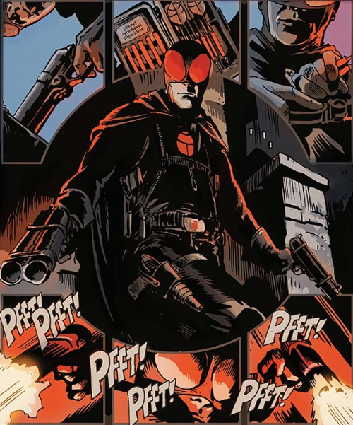
Z-View – The Black Beetle: No Way Out #2 by Francavilla

The Black Beetle: No Way Out is a four issue mini-series from Dark Horse Comics.

Written and Directed by Francesco Francavilla

While investigating a mysterious mass murder that leveled Colt City’s mob bosses, Black Beetle gets wrapped up in a puzzling maze of clues. Could the appearance of a costumed criminal named Labyrinto be related to the destruction of the powerful organized-crime racket?

*** Beware – spoilers may be found below *** The Good

  • Francavilla has set up the Black Beetle to look and feel like an old pulp magazine or movie serial.
  • Another great cover by Francavilla.
  • Love the double-page splash on pages 2 and 3.
  • “But luckily no one gets hurt.”
  • “Thankfully I never leave for an ocean trip without a respirator…”
  • “I’ve learned that, in my case, ‘unlikely to happen’ is often likely to happen.”
  • Big panel on page 11.
  • “The moment I hear him… it’s a second too late.”
  • Page 14
  • “Oh, C’mon now!”
  • Darwyn Cooke Black Beetle bonus sketch!
  • More bonus art from Francavilla!

The Bad:

  • “But even with the helipack, I arrived too late.
  • “Take care of the Black Beetle once and for all.”  Yikes!
  • Who is the person lurking in the shadows behind the Black Beetle on page 9 and coming up behind him on page 10?

The Ugly:

  • “It’s a short fall… but long enough to see all those tiny hungry red eyes… waiting for me to hit the water.  They’re all over me in a second. And they keep coming.  And coming.”
  • Water rising quickly and the escape hatch is barred from the outside!

Black Beetle: No Way Out

Rating: 5 out of 5
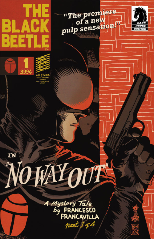
Z-View – Black Beetle: “No Way Out” #1 by Francavilla

The Black Beetle: No Way Out #1 in a four issue mini-series from Dark Horse Comics.

Written and Directed by Francesco Francavilla

Black Beetle’s investigation of two local mob bosses is interrupted when a mysterious explosion murders them and a pub full of gangsters—taking out most of Colt City’s organized crime in one fell swoop. Who could pull off such a coup, and what danger might that murderous bomber do to Colt City and Black Beetle?

*** Beware – spoilers may be found below *** The Good

  • Francavilla has set up the Black Beetle to look and feel like an old pulp magazine or movie serial.
  • Love the cover by Francavilla.
  • Followed by an equally awesome full page splash.
  • “Wish me luck.  Not that I need it.”
  • Bonus “title cards” after the story created by Francesco Francavilla.
  • “Are you from space, Mister?”
  • “Are right, Rick.  I don’t have time for this. So…”
  • The cliffhanger last page.
  • “Okay.  You’re good.  I’ll give you that.  But this is not over.”
  • Bonus teaser images by Francavilla and a Black Beetle pinup by Mike Norton.

The Bad:

  • “K-BAOOOOOOOMMM!!”
  • “All I can think about is WHO got to them BEFORE I did… While I should really be worrying about… freefalling from an EIGHTEEN STORY BUILDING.”

The Ugly:

  • “Thudd!”
  • “Constantino.”  “Huh?  “FWWWP  FWWWP”

Black Beetle: No Way Out #1

Rating: 5 out of 5
Z-View – The Black Beetle: “Night Shift” #0 Written and Directed by Francesco Francavilla

The Black Beetle: Night Shift #0 is a collection of three Black Beetle episodes that originally appeared in Dark Horse Presents #11–#13 and will lead into the Black Beetle: Night Shift four issue mini-series from Dark Horse Comics.

Written and Directed by Francesco Francavilla

When a powerful totem of dark magic shows up at the Colt City Natural History Museum, Hitler sends his fearsome Werwolf Korps to collect the piece. Unfortunately for the führer, Colt City’s protector, the Black Beetle, is on the case!

*** Beware – spoilers may be found below *** The Good

  • Francavilla has set up the Black Beetle to look and feel like an old pulp magazine or movie serial.
  • Night Shift is set in 1941 and the bad guys are Nazis.
  • Cliffhanger on page 7 leading in to full page 8 splash.
  • “I’ll take care of this.”
  • Who is the mysterious leader of Werewolf Korp?
  • Love Francavilla’s art and colors.
  • The Black Beetle’s plan to turn the tables on the Nazis.
  • The cliffhanger on the last page of the story.
  • Bonus “title cards” after the story created by Francesco Francavilla.

The Bad:

  • 1941 Nazis.
  • Black Beetle’s exposition to Dr. Howard — “It’s a long story but — due to the current situation I’ll give you the short version…” [great summary and fits the feel of the 1941 pulp comic but a bad time to be talking about it]
  • Adolph Hitler’s Werewolf Korp. Hitler, Nazi’s and the Werewolf Korp.  It doesn’t get much worse that than in 1941.  Ulp – it just did.  Who is their hooded leader?

The Ugly:

  • Being around to hear a Nazi say, “Keine Zeugen.” <“No witnesses.”>

Black Beetle: Night Shift #0 was a blast. 

Rating:

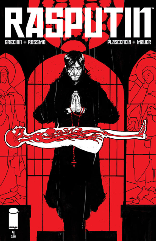
Z-View: Rasputin #4 by Grecian and Rossmo

Rasputin is an on-going series created by Alex Grecian & Riley Rossmo published by Image.

Writer: Alex Grecian

Artist: Riley Rossmo

Colorist: Ivan Plascencia

Letterer: Thomas Mauer

BETRAYED! Rasputin’s life changes forever when he’s asked to save the prince’s life. But first the mad monk has to let someone else die. His road to infamy begins here.

*** Beware – spoilers may be found below ***

The Good

  • “I know how I will die and this is not yet the time.”
  • Tsarina Alexandra’s test for Rasputin.
  • Rasputin’s repeated reactions to the doctor after helping the pet dog.
  • “He eats like a dog.”

The Bad:

  • “No, I became the animal.  Only a little bit, but… I didn’t like it.”

The Ugly:

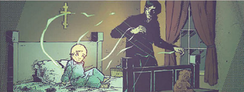
  • The “little soldier” in bed when Rasputin meets him.
  • Rasputin at the dinner table.


I enjoyed Rasputin 4 and look forward to future issues.

Rating: 4 out of 5

Z-View: Winter World #7 by Dixon and Giorello

Winter World created by Chuck Dixon and Jorge Zaffino.

Winter World #7 published by IDW Publishing.

Writer: Chuck Dixon

Artist: Thomas Giorello

Colorist: Diego Rodriguez

Letterer: Robbie Robbins


“The Stranded,” conclusion! A confrontation decades in the making! Scully and Wynn are re-united with the truck that’s been their rolling home across two seas, only to find themselves in more danger than ever. What promised to be a sanctuary turns out to be a slaughterhouse as Skitters and the feral Monkey Boy finally catch up with Scully and Wynn in a place where there’s nowhere to run.

*** Beware – spoilers may be found below ***

The Good

  • Thomas Giorello and Diego Rodriguez continue to impress.
  • The interplay between Scully, Wynn and Trina.  The sneer on Wynn’s face.
  • “We’ll find them.  Won’t we Scully?”  “Damned right we will.”
  • Rah-Rah to the rescue!
  • Preview of Tommy Lee Edwards’ art for next issue!

The Bad:

  • “Where’s Wynn?”
  • Told to throw his gun down, Scully does just that.

The Ugly:

  • Wynn to the rescue!
  • Trina to the rescue!


Winter World #7 is for mature readers due to violence.

Rating: 4 out of 5

Z-View: Winter World #6 by Dixon and Giorello

Winter World created by Chuck Dixon and Jorge Zaffino.

Winter World #5 published by IDW Publishing.

Writer: Chuck Dixon

Artist: Thomas Giorello

Colorist: Diego Rodriguez

Letterer: Robbie Robbins


Snowblind! Scully is sightless and must rely on Wynn to survive in a world that seeks to kill them at every turn. Their stolen vehicle is carjacked in turn by even more dangerous lowlifes. And their oldest enemy, Skitters, has stalked them across two frozen oceans and two icy continents and is now within striking distance. It’s a cruel world populated by crueler people where each day, each moment, might be your last.

*** Beware – spoilers may be found below ***

The Good

  • Thomas Giorello and Diego Rodriguez continue to impress.
  • “HaHaHaHa!  Didn’t know it has a hundred gallon reserve tank?”
  • “You not run?”  “I knew you lied.”  “You not scared?” “I’m scared.”  “You not RUN.”  “I’ll choose how I die.  It won’t be by getting shot in the back.”

The Bad:

  • Scully is still snowblind!
  • Being left naked in the barren, freezing cold.

The Ugly:

  • The poor baby polar bears.


Winter World #6 is for mature readers due to violence.

Rating: 4 out of 5

Z-View: Escape from New York #2 by Selba and Barreto

Escape From New York is an on-going series published by Boom Studios.

Writer: Christopher Sebela

Artist: Diego Barreto

Colorist: Marissa Louise

Letterer: Ed Dukeshire

Between the escalation of World War III and being Number One on America’s most wanted list, Snake Plissken jumps borders and finds himself in the seceded nation of Florida. While he may have escaped the USPF, Snake finds himself in the middle of a whole new level of political corruption.

*** Beware – spoilers may be found below ***

The Good

  • Dan Panosian’s variant cover [see bottom of this post] rocks!
  • “That’s not him.  Look how short he is, Erick.”
  • “Morrell, Look under the eye patch.”  “How much you give me Rip?”
  • “What happens after that?”  “Ask someone who cares.”

The Bad:

  • I’m not a fan of the cover at the top of this post.
  • I have no interest in Romulus and Remus.  I realize EFNY characters are always extreme but the characters in this series seem to be written for little kids.
  • Being held prisoner in four submarines welded together.

The Ugly:

  • Meemaw.


Escape from New York #1 should appeal to fans of the movie, Escape from, oh, you know.

Rating:

Z-View: Shaft #2 by Walker and Evely

Shaft is an on-going series published by Dynamite. Shaft created by Ernest Tidyman.

Writer: David F. Walker

Artist: Bilquis Evely

Colorist: Daniel Miwa

Cover Shown: Denys Cowan, Bill Sienkiewicz & Ivan Nunes

Every great detective has their first case. For John Shaft, that first case seems simple enough. But tracking down a missing person for his girlfriend quickly turns into a matter of life and death. With the bodies piling up, Shaft realizes he’s in over his head. But can he stay alive long enough to figure out what is going on, or will his first case be the death of John Shaft?

*** Beware – spoilers may be found below ***

The Good:

  • Still diggin’ the art by Bilquis Evely.
  • “Could spot a booster from a mile away.  That’s ’cause I used to be a booster.”
  • Double page splash showing Shaft’s relationship deepening.
  • “Keeping her safe is the most important thing.  That’s the only thing keeping the four-eyed ************ alive.”
  • “It was like someone opened a cage and let the animal out.”
  • Evely gets the feel of the period down pat.

The Bad:

  • “The fact that they’re following us this close says a lot.  First, they don’t care if we know.  Second, if they don’t care that we know, they don’t think we’re a problem.”
  • “They were either cops or gangsters…”

The Ugly:

  • The last page of the issue… and I can’t wait for #3!


Shaft #2 should appeal to fans of the Shaft movies and is for mature audiences due to adult language.

Rating: 5 out of 5
Rating:

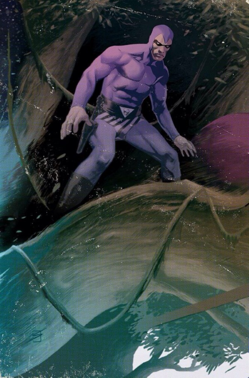
Ron Salas has that Phantom Vibe!

That’s Ron Salas’ variant cover art for The Phantom #1.

Bleeding Cool posted a slightly larger version of it along with a black and white version with this comment:

Now this issue has the Darwyn Cooke cover as do the others and it has a Rob LIefeld cover, but this one also has a very cool looking Ron Salas cover which we have here both colored and uncolored. Honestly, of the three I think this is the one I’d grab because it has such a cool Phantom vibe.

Wow!  High praise indeed!

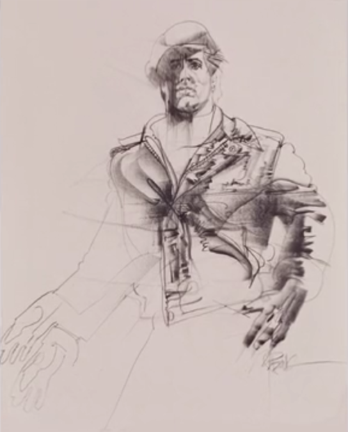
Sly Stallone and “The Drawings of Bob Peak”

The Bob Peak drawing above is of Sylvester Stallone from Paradise Alley!

I discovered the piece as part of an advertisement for a new book of Bob Peak drawings being put together by Thomas Peak through Kickstarter.  Here’s the book’s description…

“THE DRAWINGS OF BOB PEAK”.  This new 160 page oversized soft cover book (14″ x 11″) curated collection of his best drawings is a comprehensive look into a rarely viewed side of Bob Peak with never before seen charcoal, graphite, art marker, pen, ink, pencil, and pastel drawings from the maestro himself.  This oversized book will take on the look and feel of the actual artwork with drawings large enough to study and admire the mastery of the artist Bob Peak.  A “Collectors Edition” of (100 copies only) is also available.  Produced by Art Works Fine Art Publishing which also produced the original “The Art of Bob Peak” book, this new book will be of the same high quality that you expect and I require.  I will produce nothing surrounding the legacy of my father Bob Peak that does not meet with the highest standards.  I appreciate your support.  You will NOT be disappointed.

I’ve backed the project and the book was well worth the bucks.  If you missed out, you can still find copies on Amazon.

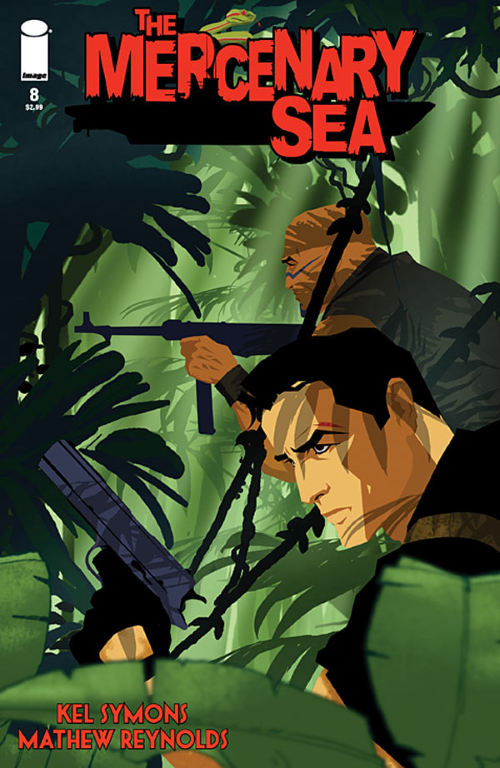
The Mercenary Sea #8 by Symons and Reynolds

The Mercenary Sea is an on-going series created by Kel Symons & Matthew Reynolds published by Image.

Writer: Kel Symons

Art and Colors: Matthew Reynolds

Letterer: Pat Brosseau

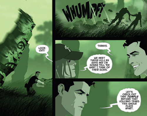
“ON TREASURE ISLAND” The second of a two-part story: On the hunt for Koji Ra, Jack and the crew of the Venture explore ancient ruins on a deserted island and run into an old adversary. This issue also includes a bonus short story just in time for Christmas.

*** Beware – spoilers may be found below *** The Good

  • Matthew Reynolds kicks things off with another impressive cover.
  • Kel Symons sets the table with a race against time [an unstable volcano about to blow] and an old adversary hunting for the same treasure.
  • Regular readers will be surprised by this one: I like the blur effect on page 6, panel 3.
  • The splash on page 11.
  • “Can we go again?”
  • The bonus Christmas story!

The Bad:

  • “The room is flooding!”
  • “There’s too much water pressure.”
  • “No good, Skipper.  No way out up here.”

The Ugly:

  • The centipede’s path.

The Mercenary Sea #8 should appeal to all who old time action and adventure.

Rating: 4 out of 5

The Mercenary Sea #7 by Symons and Reynolds


The Mercenary Sea is an on-going series created by Kel Symons & Matthew Reynolds published by Image.

Writer: Kel Symons

Art and Colors: Matthew Reynolds

Letterer: Pat Brosseau

“JOHNNY ONE-NOTE” The book BuzzFeed calls one of the top indie comics you should read returns with an all-new adventure. Jack Harper, captain of the Venture, tracks down clues about the legend of Koji Ra from an antiquities dealer in occupied China.

*** Beware – spoilers may be found below ***

The Good

  • Bottom panel page 7 – simple but effective
  • Abbott and Costello would have been proud – page 9, panel 1
  • “I owe that guy a drink.”
  • Last page splash.

The Bad:

  • Usually I lead off The Good with praise for another Matthew Reynolds‘ cover.  This one isn’t bad, but it isn’t up there with my other Mercenary Sea favorite covers.  Any guesses why?  Yep, the background blur effect.

The Ugly:

  • Not a thing this issue.

The Mercenary Sea #7  should appeal to all who old time action and adventure.

Rating:

Z-View: The Mercenary Sea #6 by Symons and Reynolds


The Mercenary Sea is an on-going series created by Kel Symons & Matthew Reynolds published by Image.

Writer: Kel Symons

Art and Colors: Matthew Reynolds

Letterer: Pat Brosseau

“TOP HAT, WHITE LIE, AND TALES” Jack and Evelyn, a.k.a. “Top Hat,” are captured by Tono, locking the outclassed Venture into combat with a top-of-theline Japanese destroyer.

*** Beware – spoilers may be found below ***

The Good

  • Another excellent cover by Matthew Reynolds
  • Symons comes up with a great and ingenious way for Jack to get word to his crew.
  • Page 14  is really nicely done.

The Bad:

  • “We took a direct hit aft, sir!”
  • “Feels like I just cut in on another girl’s dance.”  “I don’t take spins around the floor with my crew.”

The Ugly:

  • Still not a fan of the out of focus/blur effect — see page 19.

The Mercenary Sea #6  should appeal to all who old time action and adventure.

Rating: