Category: Art

Undertow #1 / Z-View


Undertow is an on-going series created by Steve Orlando & Artyom Trakhanov published by Image.

Writer: Steve Orlando

Artist: Artyom Trakhanov

Atlantis is the world superpower, and Redum Anshargal is its worst enemy. If you want to break free of the system, he can offer you a place at his side, exploring the wild surface world in his watertight city barge The Deliverer. He and his hostage-protege Ukinnu Alal hunt the Amphibian, a legend that could be the key to an air-breathing life on land. But as they become the hunted, can Anshargal’s team survive long enough to turn the tables on the godlike beast they set out for?

The Pitch: ”Hey, the world needs a comic set in Atlantis featuring a fully developed world from issue one, with a story that expects a lot from the readers, doesn’t dumb things down and features art smart enough to match the story.”

“Let’s do it!”

The Tagline:  “You can die right here or be reborn.”

The Overview: Ukinnu Alal was an Atlantean born to privilege.  Growing up, Alal‘s potential friends had to be vetted before he could even meet them,  Alal attended the best private schools. Upon graduation his marriage to a trophy wife and office job were pre-determined and waiting.  It wasn’t until Alal joined the military that he was truly free.

We meet Alal in the middle of a terrible undersea battle against soldiers led by Redum Anshargal. Anshargal‘s troops are brutally slaughtering Alal’s Atlantean soldiers. Alal faces certain death.  Anshargal appears and offers  Alal a chance not only to live but to join Anshargal in a quest to break free from the yoke of Atlantis and explore the world above.

*** Beware – minor spoilers are found below ***

The Good

  • Trakhanov‘s cover (shown above).
  • We are dumped into a foreign world that is fully developed.  We are strangers in a strange land and understanding may not come easily at first.
  • Orlando‘s story is dense and doesn’t dumb down for readers.  This isn’t a comic one can read in five minutes.
  • The artwork created by Trakhanov is very good.

The Bad:

  • This isn’t a comic one can read in five minutes.  Some readers won’t like working for their story.
  • The coloring is hit or miss.  Sometimes it is spot on and at other times makes the lettering hard to read or overpowers the linework.

The Ugly:

  • Going to battle against Redum Anshargal.

I liked Undertow and have a feeling that it is going to just get better and better with each new issue.  I want to know more about Redum Anshargal‘s back story.  It will be interesting to learn why Ukinnu Alal was allowed to live and more importantly why Anshargal has brought him into his inner circle.

Rating: 3 out of 5

The White Suits #1 / Z-View


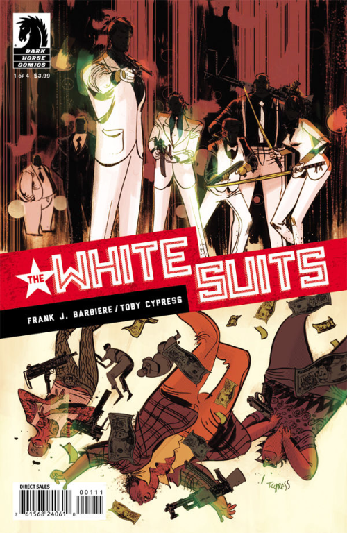
The White Suits is a four issue mini-series created by Frank Barbiere & Toby Cypress published by Dark Horse Comics.

Writer: Frank Barbiere

Artist: Toby Cypress

Mysterious killers dressed in white, they savaged the Cold War Russian underworld—then disappeared. Now they have resurfaced in New York, leaving a trail of dead mobsters. In this bloody wake, an amnesiac and an FBI agent search for the answer to a single question: Who are the White Suits?

The Pitch: “Mysterious hit men, a resourceful female FBI agent with a personal quest and a tough guy suffering from retrograde amnesia.  What do ya say?”

“Let’s do it!”

The Tagline:  “Sometimes you can tear a memory wide open.”

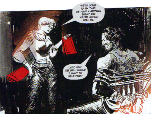
The Overview: The White Suits, mysterious hit men who took on the Russian underworld, have resurfaced in the US and are now going after American mobsters.  Sarah Anderson was a little girl when her dad disappeared along with The White Suits.  How and why is a mystery.  She’s now a FBI agent now and wants answers.  We also have a man with a violent past who suffers from retrograde amnesia.  The three are on a violent collision course.”

*** Beware – minor spoilers are found below ***

The Good

  • Frank Barbiere creates a story that moves.  He has a lot of ground to cover but it never feels like exposition.
  • The White Suits is a crime comic that encompasses a mystery or two or three but never at the sake of action.
  • Cypress’ art is loose and unique.
  • The black and white art with a splash of color works!

The Bad:

  • What happens to mobsters when The White Suits show up.
  • Cypress’ art is loose… and won’t be to everyone’s taste.

The Ugly:

  • Automatic weapons in a crowded night club.

I’m a sucker for crime fiction.  Especially well done crime fiction.  The White Suits qualifies on both counts.  Bring on issue 2!

Rating: 3 out of 5

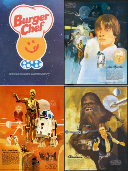
Star Wars, Burger Chef, Mike Kott and Me

Recently while cruising alone the virtual highway known as the internet I came across these three Star Wars posters.  They were available in the early 1980’s at Burger Chef when you purchased one of their meals.  I know this not because I read it in the poster descriptions but because I worked at Burger Chef in that same time period.

While the posters were popular, when the promotion ended we were left with several boxes of unsold posters.  My boss was at a loss.  He couldn’t send them back.  He didn’t want to throw them away.  He sure wasn’t going to give them away.

I had a friend named Mike Kott.  Mike and I played poker on a regular basis and shared a mutual interest in comic books, comic art, movies and the like.  Mike ran (and still runs The Intergalactic Trading Company).  I knew Mike would buy the posters if he could make a profit on them.

So I told my boss that I knew a guy who’d buy the posters if the price was right.  My boss figured that if he sold them at cost he’d be ahead of the game.  He told me the amount which was pennies per poster.

I contacted Mike and the deal was done.  My boss was happy and Mike was thrilled.  He even tossed me $100 for making the deal!  (Remember this was the early 80’s, I was working my way through college and working part time at Burger Chef.  100 bucks was big money… at least for me.)

Mike told me that he’d sell the posters for a few bucks a piece and though it may take him a while, he’d do more than alright on the deal.  I just checked and he still has a few of those posters available if you’re interested.

I know Mike said it might take him a while to sell all those posters, but I wonder if he thought that over 30 years later, he’d still have some in his inventory.

I have more Mike Kott stories that I’ll share… in the near future I’ll tell you about Mike Kott and the Burger King Star Wars posters.

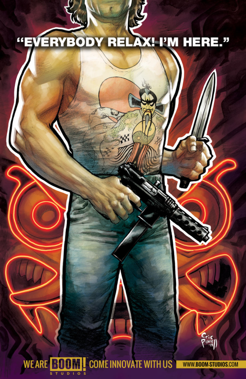
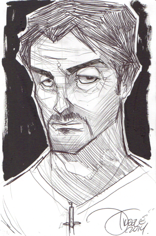
Jeremy Treece’s Bad Rambo Quickie Bonus Sketch

Jeremy Treece has created art for comic books, trading cards, animation and independent films. Last week I posted Treece’s take on Sly Stallone.

Today I want to share the quickie sketch that Jeremy drew on one of the backing boards sent to protect the art.  Gotta love it!

You can see more of Jeremy’s art here… and hopefully again here at the SZ in the future.

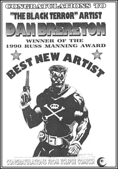
Remember When Dan Brereton Won the Russ Manning Best New Artist Award?

I’ve been a Dan Brereton fan since I first saw his work in The Black Terror.  [Someone should publish a nice trade edition of The Black Terror, but we’ll save that for another post.]

Here’s a cool ad congratulating Brereton for winning the 1990 Russ Manning Award for Best New Artist.  [And I have to say, I’ve always loved that Black Terror drawing.]

I’m (Almost) Set for MegaCon 2014


I’m set for MegaCon.  

I’ve got my hotel booked and my con passes purchased.  

Now all I have to do is sort through the Comic Book Guests and Artist Alley lists to decide who I will I try to get a Stallone sketch from.

Then I need to try to find out their sketch prices and see how it fits my budget.

Then I need to update my reference for artists.

Then I need to pull together the items I need for autographs.

Then I need to check out the panels, to see which I plan to attend.

Oh, and I should probably look at the Media Guests just to make sure there’s no one I’d like to see.

Okay, maybe I’m not quite set for MegaCon, but I do have my hotel booked and con passes purchased.

Z-View: The Mercenary Sea #1


The Mercenary Sea is an on-going series created by Kel Symons & Matthew Reynolds published by Image.

Writer: Kel Symons

Artist: Matthew Reynolds

Action and adventure set in 1938—The South Seas. Japan has invaded China. War in Europe is imminent. Ex-bootlegger Jack Harper captains The Venture, a refitted German U-Boat, with a crew of expats, mercenaries and treasure hunters. They do whatever it takes to stay afloat, often running up against pirates, headhunters, spies, and soldiers. They’re always one step away from the greatest score of their lives…or their certain demise.
The Pitch: ”Hey, someone in comics should do a pulp action comic, you know a real throwback about a ragtag group of mercenaries led by an Indiana Jones-type who loves adventure and righting wrongs.”

“Let’s do it!”

The Tagline:  “Nice work if you can get it”

The Overview: Jack Harper is the leader of a group of mercenaries who make their living searching out adventure and taking jobs that bring them into contact with pirates, cannibals, treasure and the occasional job that pays real money.

In the first issue we meet Jack Harper (romantic adventurer) and his crew…

  • Wulf Renner, a former German U-Boat captain with a mysterious past
  • Jarreau, a former French Legionnaire and resident cook
  • “Smokestack” Jackson, a heavyweight contender framed for murder and on the run
  • Toby, who used to work for mobsters
  • Milton Weatherborne III aka as “Doc” a disgraced British Army surgeon who lost his medical license and a patient when he operated while drunk.
  • Samantha, the team’s mechanic and daughter of a moonshiner Jack used to work with

*** Beware – minor spoilers are found below ***

The Good

  • The logo for The Mercenary Sea is one of the best in recent memory.
  • Love the cover.  Nice design, colors and execution.
  • Matthew Reynolds‘ art.  It’s got an animation feel to it that I like.  I first became aware of Reynolds’ art on an independent comic called Marlow.  I liked Reynolds‘ art then and he’s improved a lot.
  • Kel Symons introduces a fairly big cast, backstory and lays the groundwork for adventures to come without sacrificing a fun story.
  • Special kudos to Matthew Reynolds‘ coloring of the issue!
  • The first issue ends on a cliffhanger!  (As it should considering it’s source material.)

The Bad:

  • While I like Reynolds‘ art I think he overuses silhouettes and blurred backgrounds.  It’s not that I don’t like those techniques but if used too often they can lose their impact.

The Ugly:

  • Harper and his crew run into a tribe of cannibals in the jungle.  There’s a set-up and payoff on some humor that works.  I think it might have worked even better had the cannibal tribe (especially the chief) look like cannibals.  The cannibals looked more silly than scary.  So yeah, this “ugly” is that they weren’t “ugly” enough.

I look forward to the next issue of The Mercenary Sea.

Rating:


Additional Source Material: CBR.com Interview with Symons & Reynolds.

Z-View: The Saviors #2


The Saviors is an on-going series created by James Robinson & J. Bone published by Image.

Writer: James Robinson

Artist: J. Bone

You saw.  You know.  No way they let you go home, cover your eyes, put your fingers in your ears and pretend this never happened.  You’re as good as dead.

In issue one Tomas Ramirez, a slacker content living in a small town, discovered that shape-changing aliens live among us.  Tomas discovered their secret and they discovered his… that he knew.

Issue two picks up where issue one left off — Tomas is on the run in the desert from one of the morphing aliens.  Things are looking bleak when a stranger new to town provides a chance for escape… if he can be trusted.

James Robinson lulled us into the story in issue one.  Issue two flies at a breakneck pace as Tomas attempts to stay alive.

J. Bone’s art continues to be a joy.

The Saviors  is a comic for mature audiences due to drug references and language.  If you’re a fan of 50’s alien invasion movies [“I Married a Monster from Outer Space,” “Invasion of the Body Snatchers,” etc.], ,or well written, well drawn comics, then The Saviors is for you.

Rating:

Josh Cooley’s Movies R Fun


Josh Cooley is a storyboard artist for Pixar.  In his spare time Cooley works on personal projects.

His latest is Movies R Fun described as a “children’s picture book parody for grown-ups.”  

If you check out the trailer (yes, the book has a trailer) for Movies R Fun you’ll see that Cooley’s fun children’s book drawings of “age restricted” movies aren’t for children, but instead for the kid in all of us grownups.

Dead Body Road #2 / Z-View


Dead Body Road is a six issue mini-series published by Image.

Writer: Justin Jordan

Penciler / Inker: Matteo Scalera

Colorist: Moreno Dinisio

You won’t kill me.

Yet.   Won’t kill you yet.   Can hurt you though.

Dead Body Road #1 set the bar high.  Great writing, great art and a crime/revenge story that hit all the right marks.  If you liked loved Dead Body Road #1 then you’re going to dig Dead Body Road #2.

Gage is on the trail of his wife’s killers.  This points him toward Rachael.  Her husband was part of the gang that robbed the bank and killed Gage’s wife.  Problem is, some of the gang have gotten to Rachael first.  She’s tough, but in over her head.
Gage is outnumbered and outgunned but left with no other option than to save Rachael and avenge his wife.  

Justin Jordan and Matteo Scalera continue to impress as they move the story forward.  These guys are a team to watch.

Dead Body Road #2  is a comic for mature audiences due to violence and language.  If you’re a fan of crime/revenge stories then this is for you.  

Rating: 4 out of 5